Tuesday, 26 February 2013

Digipak Creation - Disk Draft


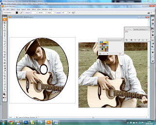
The creation of the disk of the digipak was fairly simple. I first used photoshop, to filter the original picture again and turned it into a vintage style. I created a new layer and created a circle that is similar to a disk. I placed it on top of the picture and on an area of where I want the picture to appear on the CD. I then created a background copy of the same picture and right clicked on that layer and selected Rasterized Layer.


With this option I am able to delete the areas I don't on the picture and keep the one that has the circle on top. I proceeded on using the magic wand to delete the area and left with a part of the picture in a circular shape. This is what it looks like when I moved the circle from the picture.


I got my wanted results and so I saved the picture on photoshop on a PDS file so the resolution of the picture is clear. I then opened it in Adobe Illustrator and added another circle which is the background and also used the eraser tool to make a circle in the middle to make it look like a real CD. Finally I added the same picture on the back so when the CD is taken out, the same picture is on the back as well.


I made another version of my Disk Design because I thought the picture for the first design could be used for the front of the CD. When I created the draft for the second version, I thought it looked a lot better and looks like a real CD.


Thursday, 14 February 2013

Digipak Creation - Back Draft

This is the original picture without any filters. I chose this picture mainly because I wanted the star image looking into the horizon to give that feeling of him having deep thoughts and wonder. Which makes him look like a serious artists and further relate to the genre. Additionally,the space on the right is where I could place the texts and other components such as barcodes and logos.


I didn't want to go the typical filter: Sepia. Instead, I used the Colour Balance to change the mood of the picture - I altered the picture by adjusting the Luminance, Colour Intensity and Fade on both Midtones and Highlights and in result created a rather vintage look. I thought the filter suits the environment as well as the style of the genre. It also compliments the background and my costume.

I further altered the filter by adding in more modifications. I changed the Shadows of the current filter and adjusted the colours to make it slightly moody then before. Making the vintage look stronger than before which makes it such an improvement. I also ticked the "Preserve Luminosity" to make the picture highlighted.

This is the final outcome of the first draft - the only improvements that I need to make is to rearrange fonts and add in the barcodes and other texts.

Friday, 1 February 2013

Digipak and Advert Mock Up


These images above shows a mock-up of a digipak that I and Mumina created after we examined how they are structured. We have laid it out this way and imitated the typical convention of a poprock/soul adverts and digipak. The picture on the top left is of the front cover, showing the star image as well as the artist and album name. The top right is the back of the digipak, showing the list of songs, barcodes etc. The bottom left is the picture you see when you open the digipak. I chose a picture of a guitar instead of a star image because I believe that there are too many pictures of the star image and instead I wanted to show something that represents the genre as well as the main prop used throughout the music video. Lastly the bottom right is the picture of the CD, for this I thought the idea of having a picture of myself behind the CD and the CD itself would just have my name and/or album name. So when the CD is taken out, it would have a picture of myself.

The advert is also simple as well. With the help of analyzing adverts - I copied the idea of having logos at the bottom of where it could be sold in. The album name and artist name would be in big and bold to highlight it's importance. On the left side of the advert I will have the information and have the "Click Here" to imply that it can be an online advert as well for online purchase. I will be positioned on the central to suggest that I am the star image.

by Julius Conmigo

Digipak Research and Ancillary Text Fonts


Before making a mock-up for My and Mumina's digipak cover, I went on the internet and researched four different front covers. All from Soul and Pop Rock Genre. I noticed that most soul and pop rock album covers, have the artists in a close up shot. This is a strategy that they use in order to sell the star and their music as well. I also noticed that they have somewhat have a filter in their pictures, in these images, three of the album covers have a black and white filter - this is to emphasize the feeling of nostalgia and passion within their songs and in relation with newspaper it tells us the 'Truth' implying they are meaningful and truthful about their music. However, Kris Allen's cover is colored, but his genre is within the direction of pop-rock just like Parachute and Pink. I also realized that all of these images, the artists are not making a direct mode of address - this body expression tells us that they are deep in thought or wonder. They also look very serious in these pictures. Whereas Pop artists such as Rihanna or Jessie J, they all have a direct contact with the audience, as they are selling their music and focused on the star image. They also have sometimes provoking albums and look modern than soul/pop-rock genres.

With these four images of pop rock and soul genres, it also gave me a broader idea of what the Ancillary Text Font design will look like for the digipak/advert. I wanted to see the typical fonts that soul/pop-rock genres used in their album covers, and then I would apply these certain conventions. I noticed straight away that the majority of the fonts are in bold, capitalized letters and the fonts does not really differentiate from the other album covers, like having a special type of font. They are all rather simplistic, in my own opinion, makes them look mature and serious as an artist. You can see this in other genres such as Country and Folk, and makes the font look very important and because it is in capitalized letters it shows how important and the album is focused on the star image. Moreover it just proves that the genre is meaningful and serious about their songs, whereas genres such as Pop are more about beats and less meaningless in their songs as they are more focused on the branding of the artist.


Mumina and I went on 1001fonts and selected five different fonts that I can use for my artist logo. I selected these specific ones as they relate to the style of artist as shown above. Since the genre was slightly pop-rock, I chose the font "Rock it", however it seemed to gritty and edgy for the genre and reminds me the font of Kerrang. Although this was just a suggestion, as were focused more on Soul genre. The two fonts that I like, are "Minerva 16 Regular" and "Kalenderblatt Grotesk" as I believe they would suit the style of the genre. However I and Mumina are going to decide out of the two of which one will look better and appropriate. Although I picked the fonts Quattrocento Regular and Almonte-Regular TTF, I thought they fit the style of the genre but comparing it to the other fonts, these two fonts seemed too plain. As you can see everything is, either bold, capitalized or both as I wanted to use the idea of having importance into my name, after all it is focused on to me as a star image.

UPDATE -   I thought the idea of changing the stars name to Vincent De La Reyes instead of Julius Conmigo. As I thought that name would sound more sophisticated and my name didn't sound like a singer
by Julius Conmigo


Contact sheet (Photos)


These are my pictures in a contact sheet that Mumina took for the Digipak and Magazine Advert. We took the pictures at Mudchute Park because we wanted to take the pictures of where the performance is based but this also combines both the main product and ancillary text is it will make a strong link between the two. Mumina took the pictures of me in different poses in different positions around Mudchute Park. There are overall twenty-seven photos, I did not chose to upload the other photos as they didn't look good. Out of these twenty-seven photos, I only took five photos, four for the digipak and one for the magazine advert.

Advert Analysis 2 - Rihanna


The second advert that I will be analysing, is from Rihanna's album: LOUD. Although she is an artist from the pop genre, I was instantly drawn to this audience, as the various conventions such as compositions, lighting, clothing, location and even posing, can represent and reflect upon my genre and ideas. I want to extract the idea of this advert as being related to country, pop-rock or soul genre.

 The colour scheme and the main image is very similar to her album cover, which also features on the advert. The colours and images all link together which makes it easier for the target market to spot or notice Rihannas Loud album. The use of red on the advert and digipak connotes a sexual vibe although yet, dominant, brave, confident, it could also represent her lust in her music. The font and lettering is the same as on the album cover but a bit bolder because the target market needs to be able to notice the release date straight away. The angle of the shot used for the main image is a low angle which shows Rihanna is dominant which links in with the use of red. From the image it looks like she’s crossing her arms and looking into the distance, this contrast with the use of red and the low angle shot as she looks vulnerable and shy. She’s wearing a strapless dress which is also red to tie in the whole image together; it’s a bit low cut to show some of her cleavage to make her look sexier. She’s wearing a diamond bracelet around her arm and a diamond necklace to make her look less naked and makes the image more feminine. You can’t really see her face properly because her hair covers most of her face but it looks like she’s got her teethes against each other look quite sexy and the fact her hair is covering most of her face shows that she’s shy which is a contrast what she really is.

The background of the main image looks like it’s been shot on a wheat farm which gives it that edge instead of just taking pictures on grass and the colour of the wheat goes well with the colour scheme. It’s got a warm, earthy tone to it. The image has been taken in the middle of nowhere like she’s lost and lonely which connects to her body language. One of her singles called Only Girl in the World which also connects to the image as she does look like the only girl in the world who has been isolated. From this image and the video for her actual song there is a massive contrast as she is shown way more confident and powerful in the video rather than here as well. On the advert an image of her album cover is also included so everyone can see how the cover looks so they won’t need to look around for it in the shop; they’ll already know how it looks. The main image has been shot on the rule of three rather than the middle as it’s so typical and boring to just shoot someone in the middle and there’s space for the image of the album on the right. From Rihanna dying hr hair red there was loads of females and males that started dying their hair red as well, this shows how influence Rihanna is as an artist and how her fans look up to her.


by Julius Conmigo

Advert Analysis 1 - Ed Sheeran


The first Advert I am going to analyse is by Ed Sheeran of the release of his new album '+', which is really simple enough. Typically means to add onto something but In my opinion, it resembles the cross sign you would typically see in hospitals, meaning to aid someone - or aid or heal people through his music in his case. The composition of this advert is carefully thought out, to appeal to the specific target audience and let them know about the album. 

The composition of the advert is very simple. Ed Sheeran is positioned on the right side of advert seen in distinct, scratched-effect orange, which is also making a direct mode of address to the audience, implying that he is in contact with his fans and viewers. The colour scheme is simplistic, although it is minimal; it is also effective in many ways and relates to Ed Sheeran himself. Since the advert is made of up entirely orange and becomes distinct on his face, it becomes very eye catching and recognisable; the colour is somehow his 'Icon' as it is his hair colour. It's also seen in a lot of representation in different forms of media such as gigs he has been in, the lightings are of a orange glow and lyrics used in his songs. A lot of Ed Sheeran's merchandise his record label, by Atlantic, sells is orange. This reoccurring colour scheme not only becomes a selling point but also fans are easily recognised by this style that Ed Sheeran uses. 

The information is located at the left side of the advert, from the middle going down, as people usually would read from left to right. It has been positioned his way too, so that there is still orange at the top and it does not dominate the whole advert and take away the star's persona or imagery. It has a pattern of black and white for each line it makes, to make the writing more visible. The font has a edgy look to it, resembles the font of 'Type-writer' to give off a simplistic but an individuality style that reflects on himself and his songs, additionally the font is rather scratchy as well, to make it appear as if it is hand-made and personal, to give the impression that Ed Sheeran is dedicated to his fans. 'Ed Sheeran', '+' symbol and 'click here to buy from' is all highlighted in white instead of black, to make it visibly clear and in a way highlight it's importance in merchandising and be seen by audiences, moreover the Ed Sheeran and the '+' symbol are in dominant fonts again to create its importance of his name and album. 'Out now' makes the audience or buyers aware of the album's availability. Lastly the word 'CLICK' is highlighted is underlined, informing the audience that they can click on that word to buy the album from the listed shops (either through retail or internet) which adds an interaction to the advert. 

By Julius Conmigo

Digipak Analysis 2 - Adele


The first digipak I am analysing is Adele's second studio album "21". Both images of adele is seen at the front and back of the digipak - where you can see the list of her songs. This is to promote the star herself, as Adele is extremely famous and known worldwide. Adele's album picture in the front, is of the colours of black and white, or in de-saturated colours. These colours used, instantly gives a feeling of deep emotions and captures the sense of passion within her music and style. Moreover, black and white can sometimes indicate the idea of the past or nostalgia, relating to a lot of classic artists such as Dionne Warwick, who also uses de-saturated colours on her album picture. As well as her songs - such as the famous hit "Someone like you" this ballad was inspired by a broken relationship, and lyrically it speaks of Adele coming to terms with it. This further emphasises the style of her genre; Soul.

In the sense of pysical appearance. Adele, is positioned in the centre of the album, making her the centre of attention or considered as the most dominant image. This makes it easily recognisable by fans. Adele is not making a direct mode of address to the viewer , her head is slightly tilted and her hand at the back of her head. This body expression of hers suggests that she is in deep thought and wonder of something or someone, again seemingly looking as if she is in the state of nostalgia.
The digipak is laid out in an organised composition. The list of the songs is located at the back of the digipak, making it very easy for the buyer/viewer to see the list of songs included in the album. Along with the bar code and additional information. Adele is positioned on the right of the digipak, which is different from the front cover. This time she is giving a direct mode of address, looking directly at the viewer, probably to connect herself with the audience and in a way it seems as if Adele is appreciating the idea of the viewer/buyer picking up her album.

The title of the album is called "21". It seems unusual for an artists as well known as her to name it after a number, but there is a meaning behind it. Adele found it as the most fitting title as it represented her age and served as an autobiographical period piece. This also symbolised the personal maturity and artistic evolution since her debut.
by Julius Conmigo

Digipak Analysis 1 - Mumford & Sons


The digipak I am analysing will be the indie-folk band "Momford and Sons". The group is seen in an extreme-long shot located at a village holding, what seems to be a festival. The atmosphere and mise-en-scene seen, emphasises the genre of the band. This is because Indie-folk is usually seen in a lot of festivals and concerts.

The background of the digipak is blurred, as everyone was moving around when the picture was taken. Furthermore three of the people in the group are looking directly at the camera whilst one of the group member is looking at person on his left. They don't have a specific pose, but casually sitting for the camera. This implies that everything happened in the moment, a picture that we could see a relation is from a festival or a party. This is to imply the idea of indie genre being individual or different from all other mainstream genres such as Pop or Rock music. In those genres stars would usually be portrayed in a specific pose or seen in an extreme-close up to promote the star in the image. The physical appearances of the stars are two group members in the middle are wearing formal clothing, whereas the other two are wearing casual clothing again, it implies the idea of the group member being different from each other hence indie, again Pop bands such as "Little Mix" They have some sort of style that are similar to each other.

The props that are seen in the digipak are flags: seen across the picture, junk and a horse on the far right, which is unusual for a CD cover, again suggesting that it does not entirely have to used specific props or any form of CGI to create the digipak used in mainstream music genres, which is common for a lot of genres, although with this digipak, it makes it more naturalistic and real as it is folk genre. The band of this image does not seem too dominant, they are more in the sense of selling their music rather seeing them as a particular star image. The digipak cover, make it seem that the band is aiming itself to a much more older audience, the age of 25-30 or above (or maybe a sub audience such as; teenagers that approach themselves to folk music)

The title of album is called "Babel" which means 'A scene of a noisy confusion'. This immedietley becomes relevant to the digipak, by observing of what is happening at the back from the digipak, people are portrayed in a 'noisy' and a 'hazy' effect to create that sense of illusion of the festival being lively. The font of the band name is simple, although it resembles country genre a little because of the "&" and the "B", the style is rather old fashion and slightly elegant. The picture is in high key lighting to connote the happiness and joy of the atmosphere as well as giving a positive impulse towards the target user.


By Julius Conmigo

Post Productions : Ancillary Text

For the post productions, I am going to carry out analyses of 2 digipaks and 2 adverts to help me investigate and explore into the codes and conventions of ancillary texts in the Soul/Pop Rock Genre. Doing this research will give me a better understanding of the conventions I could apply when designing the digipak and advert to allow people to familiarize with the specific genre that we have used.