A2 Advanced Portfolio
Tuesday, 7 May 2013
Wednesday, 1 May 2013
Tuesday, 26 March 2013
Digipak and Advert - Finished Version
This is my final version of my digipak and advert. I did all the improvements I had to do and in my opinion, looks a lot better than the draft. Especially a huge improvement on the disk. I added the recording companies of where the song will be distributed I.e. Sony BMG. I also added an infringement copy right information around the disk to make it look very professional, finally I also added a spine to the digipak. With the advert I made the texts bigger and bolder to grasp the attentions eye by making it into capital letters with bright writing and a black background so they are able to see it. I added where the song can be brought and websites where you can follow the singer and keep updated with his latest music/information.
Although the only flaw here is that the images are not in high resolution which makes the images look like pixels and blurry. But overall I am happy with the final outcome of the digipak and advert.
Friday, 8 March 2013
Digipak and Advert Draft 2
These are my drafts for my Digipak and Front Cover. The improvements I am going to make are by adding more text to the Disk of the digipak to make it look like a real CD. Also I need to change the filter of the picture of me looking away into a beige tone to match with the colour theme of the digipak I also need to add the name of the album on the front of the digipak as well as add more information on the back of the digipak.
The only improvements I will make on the advert is to rearrange it to make it look professional and laid out well and also make the texts bigger and add the name of the album to make it informative and eye-catching.
Advert Creation Draft
When creating the advert for the digipak, I firstly looked for images on the internet of where my product will be sold. for example iTunes was one of them. I took an image of off google, then copied it onto Photoshop.
I deleted the white backgrounds and areas so that it would be nothing but the writing and the icon. Using the Magic Wand tool, I highlighted all of them and used the paint bucket to colour them in the same colour scheme as the Digipak, being Beige.
It didn't take long and as soon as I saved it, I opened it on Adobe Illustrator and fit it across a black in front of a black background so the viewers can see it easily.
This is how the Advert will look like so far. I am deciding to add the same filter again, and re-arrange and try different compositions.
Digipak Creation - Front and Side Draft
Inside the digipak, I decided that I should have a picture of the location of the music video. This is to further emphasise the the emotion of one being lonely and relate to the song and the singer. I have added a filter on each of the pictures and deciding which would suit the digipak best. As for the front cover of the digipak, I have chosen this specific image because looking at different artists from the same genre, their digipak's front cover picture would always have them looking away or looking at the distance. This is to create the feeling of their seriousness with their music and not entirely looking to sell their star image. Unlike pop music, they are usually giving a direct mode of address.
Tuesday, 26 February 2013
Digipak Creation - Disk Draft
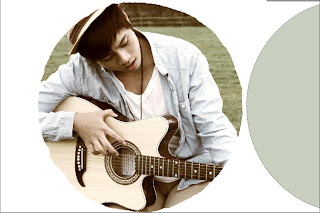
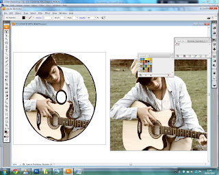
The creation of the disk of the digipak was fairly simple. I first used photoshop, to filter the original picture again and turned it into a vintage style. I created a new layer and created a circle that is similar to a disk. I placed it on top of the picture and on an area of where I want the picture to appear on the CD. I then created a background copy of the same picture and right clicked on that layer and selected Rasterized Layer.

With this option I am able to delete the areas I don't on the picture and keep the one that has the circle on top. I proceeded on using the magic wand to delete the area and left with a part of the picture in a circular shape. This is what it looks like when I moved the circle from the picture.

I got my wanted results and so I saved the picture on photoshop on a PDS file so the resolution of the picture is clear. I then opened it in Adobe Illustrator and added another circle which is the background and also used the eraser tool to make a circle in the middle to make it look like a real CD. Finally I added the same picture on the back so when the CD is taken out, the same picture is on the back as well.
I made another version of my Disk Design because I thought the picture for the first design could be used for the front of the CD. When I created the draft for the second version, I thought it looked a lot better and looks like a real CD.
Thursday, 14 February 2013
Digipak Creation - Back Draft
I didn't want to go the typical filter: Sepia. Instead, I used the Colour Balance to change the mood of the picture - I altered the picture by adjusting the Luminance, Colour Intensity and Fade on both Midtones and Highlights and in result created a rather vintage look. I thought the filter suits the environment as well as the style of the genre. It also compliments the background and my costume.
This is the final outcome of the first draft - the only improvements that I need to make is to rearrange fonts and add in the barcodes and other texts.
Subscribe to:
Comments (Atom)


